
Naïve Bayes classifiers are a family of simple “probabilistic classifiers” based on applying Bayes’ theorem with strong independence assumptions between the features.
In this post you will learn about
- What is Bayes Theorem
- Naïve Bayes Classifier
- Why is the algorithm called Naïve Bayes
- Advantages and applications of using Naïve Bayes to classify data and its underlying assumptions
- Types of Naïve Bayes Classifier
- Applying the Naïve Bayes classifier on a whole distributor dataset using R language
Bayes theorem
Let’s assume that we’re in the warehouse. For a warehouse, we’re doing some analytics. There are two machines in the plant, and they’re both making boxes.

The machines today operate at varying levels and have very different characteristics, but in general they generate the same boxes. And then at the end of the day we’ve got a whole pile of these boxes and the workers go through them, wherein their goal is to pick out the defective boxes. Now the question we’re going to be asking is what’s the probability of machine 2 producing a defective box . So if you take a random box produced by machine 2 as it comes out of the from the conveyor belt ,what is the probability that the box is defective. The way we’ll get operability is through some information that will already be given at the start. So we’ll have a look at that information later, but the rule or the mathematical concept that will be used to get that probability is called the Bayes Theorem. Here’s a mathematical representation of it :
P(A∣B)= P(A)*P(B∣A)/ P(B)
Our result for dependent events and for Bayes’ theorem is both valid when the events are independent.
For derivation of the Bayes Theorem please visit— https://plato.stanford.edu/entries/bayes-theorem/
Let get back to the information that is provided to us.
Well we are given that machine 1 produces 30 boxes per hour and machine 2 produces 20 boxes per hour. Hence the probability of box produced from machine
| Production/hour | P(M) | P(M/defect) | |
| Machine1 | 30 | 30/50 | 0.5 |
| Machine2 | 20 | 20/50 | 0.5 |
| Total | 50 |
1, P(Machine1)= 30/50= 0.6—1
Similarly probability for machine 2 is, P(Machine 2) =20/50 = 0.4 —2
OK great.
Also out of all the produced parts we find that 1 percent are defective or P(defect)=1% —3
We are also given that out of all the defective parts we can see that 50 % came from machine 1 and 50 % came from machine 2. This means that the probability P(Machine1/Defect) or P(Machine2/Defect) that a box is from machine 1 and machine 2 given that it is defective is 50%—4.
So this is just the defective parts, but the question is what is the probability that a box produced from machine 2 is defective.
So let’s have a look at how we can rewrite this information in more mathematical terms. So the first line what does it tell us it tells us that :
We need to find P(defect/Machine2)
Now applying Bayes theorem using equation 1,2,3,4 we get
P(Defect/Machine2)= P(defect)*P(Machine2/defect)/ P(Machine 2)
P(Defect/Machine2)= 0.01*0.5/0.4 = 0.0125 or 1.25%
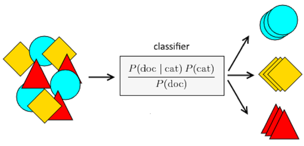
Naïve Bayes Classifier
Naïve Bayes is a Supervised Machine Learning algorithm based on the Bayes Theorem which is used to solve classification problems by adopting a probabilistic approach. This is based on the premise that the predictor variables in a Machine Learning model are independent of each other.
Classifier Naïve Bayes can be used with categorical predictors for results. It works well with categorical predictors. If we use a collection of numerical predictors, then several records are extremely unlikely to have the same values on those numerical predictors.
Lets see how the algorithm works
Taking the above example lets say that the machines1 and 2 produce half of the boxes as red and the other half as blue.
Hence, the number of red boxes produced per hour is 25 and the number of blue boxes are also 25 per hour. Hence the probability of that the boxes are red produced from machine 1 is P(M1R)= 15/25 and machine 2 is P(M2R)= 10/25
Similarly for blue box we get P(M1B)=15/25 and P(M2B)=10/25
Also lets take the P(M1R/defect)= P(M2R/defect)= P(M1B/defect)=(M2B/defect)=0.25
| Production/hour | Red | Blue | P(MnB/defect) | P(MnR/defect) | |
| Machine1 | 30 | 15 | 15 | 0.25 | 0.25 |
| Machine2 | 20 | 10 | 10 | 0.25 | 0.25 |
| Total | 50 | 25 | 25 |
Then based on this Probability of a defect based on multiple parameters is given by
P(defect/ M1B, M1R, M2B, M2R)=
P(defect)*P(M1B/defect)* P(M1R/defect)* P(M2B/defect)* P(M2R/defect)/P(M1B)* P(M1R)* P(M2B)* P(M2R)
=0.01*0.25*0.25*0.25*0.25/(0.6*0.4*0.6*0.4)
=0.000678
Why is the algorithm called Naïve Bayes ?
Well the answer is simple.
The answer is because the Bayes theorem requires some independent assumptions and the Bayes theorem is the foundation of the Naive Bayes machine learning algorithm and therefore the data base machine learning algorithm also relies on these assumptions which are many times not right and so it’s kind of naive to believe that they’re going to be correct.
Let’s go back to our example and see what that means.
So here we’ve got machines and defective boxes.
Right.
And based on those we’re using the Naive Bayes theorem to classify our datapoints into those which are defective and those which are not. Well the Bayes theorem the way we apply it requires that machine and defective boxes have to be independent and that is a fundamental assumption of the
Bayes theorem. But in our case if you just think about it fundamentally it is probably not the case.
Probably there is some sort of correlation between machines and defective boxes because as the machines gets older there is high chance of getting a defective box. It might not be a super strong correlation ,but overall there is some sort of correlation. Therefore given that they might not be independent you still apply the Bayes theorem to machine learning , that’s why it’s called Naive Bayes theorem.
Advantages for using Naïve Bayes to classify data:
• Algorithm can handle missing or disorganized datasets relatively well
• Algorithm requires less training examples than other methods
• Algorithm can easily obtain the estimated probability for a prediction.
Algorithm relies on two assumptions:
- Algorithm is not as well equipped to handle datasets with many numerical features.
- Estimated probabilities are less reliable than predicted classes.
Applications of naïve Bayes Algorithms
Real Time Prediction: Naive Bayes is an eager classifier for learning and it is sure to be fast. Thus it could be used to make real-time predictions.
Multi class Prediction: This algorithm is also well-known for the function of multi class prediction. Here we can estimate the likelihood of target variable in multiple groups.
Text classification / Spam Filtering / Sentiment Analysis: Naive Bayes classifiers often used in text classification (due to better multi-class problems and independence rule) are more efficient than other algorithms. As a consequence, spam filtering (identifying spam e-mail) and sentiment analysis (identifying positive and negative c in social media data) are commonly used.
Recommendation System: Naive Bayes Classifier and Collaborative Filtering t together create a Recommendation Framework that uses machine learning and data mining techniques to filter unseen knowledge and determine whether or not a user needs a given resource
Types of naïve Bayes Classifier:
Multinomial Naive Bayes: Feature vectors represent the frequencies with which certain events have been generated by a multinomial distribution. This is the model of events usually used for classification of documents.
Bernoulli Naive Bayes: The features are independent Booleans (binary variables) representing inputs in the multivariate Bernoulli event model. This model, like the multinomial model, is common for document classification tasks, where binary term occurs (i.e. a word occurs in a document or not) features are used rather than term frequencies
Gaussian Naive Bayes: If the predictors assume a constant value and are not discrete, then we conclude that such values are sampled from a gaussian distribution. Continuous values associated with each function are believed to be distributed according to a Gaussian distribution in Gaussian Naive Bayes. A Gaussian distribution is also called Normal distribution.
About the dataset
The dataset refers to clients of a wholesale distributor. It includes the annual spending in monetary units (m.u.) on diverse product categories. Here using the naïve Bayes classifier we will try and predict that based on annual spending on different items and the region which channel does it belong to.
Below is the table containing the variables and the data:
| Variable | Variable Type | Data |
| Channel | Factor w/ 2 levels | “1”,”2″: 2 2 2 1 2 2 2 2 1 2 … |
| Region | Factor w/ 3 levels | “1”,”2″,”3″: 3 3 3 3 3 3 3 3 3 3 … |
| Fresh | num | 12669 7057 6353 13265 22615 … |
| Milk | num | 9656 9810 8808 1196 5410 … |
| Grocery | num | 7561 9568 7684 4221 7198 … |
| Frozen | num | 214 1762 2405 6404 3915 … |
| Detergents_Paper | num | 2674 3293 3516 507 1777 … |
| Delicassen | num | 1338 1776 7844 1788 5185 … |
Mathematical Interpretation of the data
We will try and use the Naïve Bayes classifier to identify and predict the type of the channel based on multiple parameters.
Putting the problem in an equation:-
P(Channel|Multiple Parameter) = P(Parameter 1| Channel)* P(Parameter 2|Channel) ……*P(Parameter n|Channel) * P(H) / P(Multiple Parameter)
We will start with importing the file in the R studio.
library(readr)
dataset = read_csv("C:/Users/Dell/Desktop/R assignments/Wholesale customers data.csv")
Next we create another variable to store the value of the dataset
dataset1=dataset
We now summarize the data as to check each parameter in the dataset and also additional information of the dataset like the mean, median, and the percentiles.
summary(dataset1)
##     Channel          Region          Fresh             Milk
##  Min.   :1.000   Min.   :1.000   Min.   :     3   Min.   :   55
##  1st Qu.:1.000   1st Qu.:2.000   1st Qu.:  3128   1st Qu.: 1533
##  Median :1.000   Median :3.000   Median :  8504   Median : 3627
##  Mean   :1.323   Mean   :2.543   Mean   : 12000   Mean   : 5796
##  3rd Qu.:2.000   3rd Qu.:3.000   3rd Qu.: 16934   3rd Qu.: 7190
##  Max.   :2.000   Max.   :3.000   Max.   :112151   Max.   :73498
##     Grocery          Frozen        Detergents_Paper    Delicassen
##  Min.   :    3   Min.   :   25.0   Min.   :    3.0   Min.   :    3.0
##  1st Qu.: 2153   1st Qu.:  742.2   1st Qu.:  256.8   1st Qu.:  408.2
##  Median : 4756   Median : 1526.0   Median :  816.5   Median :  965.5
##  Mean   : 7951   Mean   : 3071.9   Mean   : 2881.5   Mean   : 1524.9
##  3rd Qu.:10656   3rd Qu.: 3554.2   3rd Qu.: 3922.0   3rd Qu.: 1820.2
##  Max.   :92780   Max.   :60869.0   Max.   :40827.0   Max.   :47943.0
We now install certain packages
library(ggplot2)
library(caret)
library(gpairs)
Before the transform the variables to be transformed looked like this
$ Channel;        : num  2 2 2 1 2 2 2 2 1 2 ...
$ Region          : num  3 3 3 3 3 3 3 3 3 3 ...
We now transform our dataset into categorical variables wherever possible
dataset1$Channel=factor(dataset1$Channel)
dataset1$Region=factor(dataset1$Region)
You can check the two parameters in the dataset after transformation
str(dataset1)
test_set$Channel=as.numeric(test_set$Channel)
## Classes 'spec_tbl_df', 'tbl_df', 'tbl' and 'data.frame': 440 obs. of  8 variables:
##  $ Channel         : Factor w/ 2 levels "1","2": 2 2 2 1 2 2 2 2 1 2 ...
##  $ Region          : Factor w/ 3 levels "1","2","3": 3 3 3 3 3 3 3 3 3 3 ...
We now scale the dataset by using the log transform
dataset1[,c(3:8)]= log(dataset1[,c(3:8)])
Now Converting the dataset to a dataframe so that a gpair plot can be created
dataset1=as.data.frame(dataset1)
Plotting the relation between the various parameter
The function gpairs produces scatterplots for pairs of continuous variables. However, for the factors like Channel and region, gpairs includes a boxplot that compares the distribution of continuous variables.
gpairs(dataset1[ ,c(1:8)])
Below we can find the plot between various parameters.

Plotting the Bar Plot
We now plot the bar chart of the channel with respect to the regions
barplot(aggregate(test_set$Channel == 1, by = list(test_set$Region),
mean, rm.na = T)[,2], xlab = "Region", ylab = "Channel",names.arg = c(1:3)
)
Barplot1

We find for Channel 1 we have highest frequency from region 1
Barplot2
barplot(aggregate(test_set$Channel == 2, by = list(test_set$Region),
mean, rm.na = T)[,2], xlab = "Region", ylab = "Channel",names.arg = c(1:3)
)

For Channel 2 we have the highest frequency from region 2
Now there might be problem of multicollinearity ,where two or more variables carry almost the same information .This condition might cause the model to be biased towards a variable. Checking for the multicollinearity problem in the dataset so that the assumption of naïve Bayes that we discussed earlier holds true
For more on multicollinearity —https://www.statisticssolutions.com/multicollinearity/
We will attach some libraries
library (sp)
library (raster)
library(usdm)
vif(dataset1[-c(1,2)])
The VIF of a predictor is a measure for how easily it is predicted from a linear regression using the other predictors. If the VIF is larger than 1/(1-R2), where R2 is the Multiple R-squared of the regression, then that predictor is more related to the other predictors than it is to the response calculates vif for the variables in fit
##          Variables      VIF
## 1            Fresh 1.238948
## 2             Milk 2.642396
## 3          Grocery 3.651260
## 4           Frozen 1.270902
## 5 Detergents_Paper 2.919075
## 6       Delicassen 1.282866
vc1<-vifcor(dataset1[-c(1,2)], th=0.9)
identify collinear variables that should be excluded
vc1
No variable from the 6 input variables has collinearity problem.
Result of the parameters
## The linear correlation coefficients ranges between:
## min correlation ( Milk ~ Fresh ):  -0.01983398
## max correlation ( Detergents_Paper ~ Grocery ):  0.7963977
##
## ---------- VIFs of the remained variables --------
##          Variables      VIF
## 1            Fresh 1.238948
## 2             Milk 2.642396
## 3          Grocery 3.651260
## 4           Frozen 1.270902
## 5 Detergents_Paper 2.919075
## 6       Delicassen 1.282866
We find that there is no multicollinearity in the dataset
We now split the dataset into training and test dataset
library(caTools)
set.seed(123)
split = sample.split(dataset1$Channel, SplitRatio = 0.8)
training_set = subset(dataset1, split == TRUE)
test_set = subset(dataset1, split == FALSE)
For making the variable be perpendicular to each other and reducing the dimension of the dataset we use PCA (principal component analysis)
For more on PCA—–https://towardsdatascience.com/a-one-stop-shop-for-principal-component-analysis-5582fb7e0a9c
First we will check how much of the information is contained in each of the PC components.
data_reduced <- prcomp(dataset1[, 3:8])
summary(data_reduced)
Importance of components:
                                PC1      PC2       PC3       PC4        PC5         PC6
 Standard deviation          2.1995 1.7391 1.1272 1.02557 0.70739 0.50095
 Proportion of Variance   0.4424 0.2766 0.1162 0.09618 0.04576 0.02295
 Cumulative Proportion  0.4424 0.7189 0.8351 0.93130 0.97705 1.00000
Looking at the result since first four parameters explain us 93.13% of the data so we will use just four parameters from the six parameters
Applying the PCA on the dataset
pca = preProcess(x = training_set[-c(1,2)], method = 'pca', pcaComp = 4)
training_set = predict(pca, training_set)
test_set = predict(pca, test_set)
This how the dataset looks like after applying PCA.
No. Channel Region  PC1        PC2        PC3          PC4
1       2      3  1.3687378 -0.3070674 -0.2201042 -1.449161140
2       2      3  1.4223482  0.5396364 -0.1119892  0.006815459
3       2      3  1.4842295  1.2191556 -1.0294007  0.061604006
4       1      3 -0.8686306  1.1384262 -0.1686197  0.320004849
5       2      3  0.5930079 -0.4854803  0.4167320 -0.939849123
The naïve Bayes (for the basic classification procedure) is as follows:
Let’s see how we apply it to our test dataset:
- For class Channel, estimate the individual conditional probabilities for each predictor P(Parameter n / Channel)—these are the probability that the predictor value in the record to be categorized will occur in class Channel. For example, Paramter1 which is Region estimates this likelihood by the proportion of Region values in the training set between the Channel records.
- Multiply these odds by one another, then by the proportion of class Channel data
- Estimate a probability for class Channel by taking the value determined for class Channel in step 2 and dividing it for all classes by the number of these values.
- The above steps lead to the naïve Bayes method for calculating the probability that a record with a given set of predictor values Region,PC1…., PC4 belongs to Channel. The formula can be written as follows:
P(Channel /Region,PC1… PC4) =P(Channel)[P(Region/ Channel)P(PC1/Channel) … P(PC4 / Channel)]
This tells us how the test set will classify the dataset based on the various parameters Region,PC1,PC2,PC3 and PC4
In this we will apply the naïve Bayes on the training dataset first. After the model is trained , we will pass the test data into the model.
Applying the naïve Bayes classifier
library(e1071)
Training the model
classifier = naiveBayes(x = training_set[-1],y = training_set$Channel)
Now applying testing data to the model
y_pred = predict(classifier, newdata = test_set[-1])
Checking the efficiency of the model using the confusion matrix
A confusion matrix is a technique for summarizing the performance of a classification algorithm.
cm = confusionMatrix(test_set[, 1], y_pred)
Confusion Matrix and Statistics
          Reference
Prediction  1  2
         1 56  4
         2  2 26

               Accuracy : 0.9318
                 95% CI : (0.8575, 0.9746)
    No Information Rate : 0.6591
    P-Value [Acc > NIR] : 1.402e-09

                  Kappa : 0.8458

 Mcnemar's Test P-Value : 0.6831

            Sensitivity : 0.9655
            Specificity : 0.8667
         Pos Pred Value : 0.9333
         Neg Pred Value : 0.9286
             Prevalence : 0.6591
         Detection Rate : 0.6364
   Detection Prevalence : 0.6818
      Balanced Accuracy : 0.9161

       'Positive' Class : 1
We will interpret the result of the above matrix in this way
| Event | no-event | |
| event | true positive | false positive |
| no-event | false negative | true negative |
- “true positive” for correctly predicted event values.
- “false positive” for incorrectly predicted event values.
- “true negative” for correctly predicted no-event values.
- “false negative” for incorrectly predicted no-event values.
Kappa Statistic compares the accuracy of the system to the accuracy of a random system.
- Sensitivity=True Positive/(True Positive+ False Negative)
- Specificity=True Negative/(True Negative +False Positive)
Plotting the confusion matrix
test_set$pred <- y_pred
ggplot(test_set, aes(Channel, pred, color = Channel)) +
  geom_jitter(width = 0.2, height = 0.1, size=2) +
  labs(title="Confusion Matrix",
       subtitle="Predicted vs. Observed from Testing dataset",
       y="Predicted",
       x="Truth",
       caption="insightimi.wordpress.com")

We will plot the ROC curve to check the value of the sensitivity and specificity
library(pROC)
res.roc <- roc(test_set$Channel,test_set$pred)
plot.roc(res.roc, print.auc = TRUE)

We find from the graph that the specificity and sensitivity values are :
Specificity close to 0.9 and the Sensitivity is close to 1 which matches what we had showed earlier in the confusion matrix
Now lets do something interesting. We will now plot a decision boundary to check how the classifier looks when we pass any particular value through them. To make things easier we will take two parameters Fresh and Milk columns and create a model through which the values will be passed.
First we will split the dataset
set.seed(123)
split1 = sample.split(dataset3$Channel, SplitRatio = 0.75)
training_set1 = subset(dataset3, split1 == TRUE)
test_set1 = subset(dataset3, split1 == FALSE)
Now we do feature scaling
training_set1[-3] = scale(training_set1[-3])
test_set1[-3] = scale(test_set1[-3])
Fitting Naïve Bayes to the Training set
library(e1071)
cl1 = naiveBayes(x = training_set1[-3],
                        y = training_set1$Channel)
Predicting the Test set results
y_pred1 = predict(cl1, newdata = test_set1[-3])
Making the Confusion Matrix
cm = table(test_set1$Channel, y_pred1)
We now try Visualizing the Training set results
library(ElemStatLearn)
set = training_set1[-3]
X1 = seq(min(set[, 1]) - 1, max(set[, 1]) + 1, by = 0.01)
X2 = seq(min(set[, 2]) - 1, max(set[, 2]) + 1, by = 0.01)
grid_set = expand.grid(X1, X2)
colnames(grid_set) = c('Fresh', 'Milk')
y_grid = predict(cl1, newdata = grid_set)
set$Channel= test_set1$Channel
plot(set[, -3],
     main = 'Naive Bayes',
     xlab = 'Fresh', ylab = 'Milk',
     xlim = range(X1), ylim = range(X2))
contour(X1, X2, matrix(as.numeric(y_grid), length(X1), length(X2)), add = TRUE)
points(grid_set, pch = '.', col = ifelse(y_grid == 1, 'springgreen3', 'tomato'))
points(set, pch = 21, bg = ifelse(set[, 3] == 1, 'green4', 'red3'))

The following decision boundary shows us the result of the predicted values of the parameters milk and fresh, which is shown by the background colors. Furthermore, the points of shows us the actual values of the milk and fresh parameters.
Summary
We will now look at the entire code of the dataset all in its entirety.
library(readr)
dataset = read_csv("C:/Users/Dell/Desktop/Rassignments/Wholesalecustomers data.csv")
dataset1=dataset
summary(dataset1)
library(ggplot2)
library(caret)
library(gpairs)
dataset1$Channel=factor(dataset1$Channel)
dataset1$Region=factor(dataset1$Region)
str(dataset1)
dataset1[,c(3:8)]= log(dataset1[,c(3:8)])
dataset1=as.data.frame(dataset1)
 gpairs(dataset1[ ,c(1:8)])
library (sp)
library (raster)
library(usdm)
vif(dataset1[-c(1,2)])
vc1<-vifcor(dataset1[-c(1,2)], th=0.9)
vc1
library(caTools)
set.seed(123)
split = sample.split(dataset1$Channel, SplitRatio = 0.8)
training_set = subset(dataset1, split == TRUE)
test_set = subset(dataset1, split == FALSE)
data_reduced <- prcomp(dataset1[, 3:8])
summary(data_reduced)
pca = preProcess(x = training_set[-c(1,2)], method = 'pca', pcaComp = 4)
training_set = predict(pca, training_set)
test_set = predict(pca, test_set)
library(e1071)
classifier = naiveBayes(x = training_set[-1],y = training_set$Channel)
y_pred = predict(classifier, newdata = test_set[-1])
cm = confusionMatrix(test_set[, 1], y_pred)
test_set$pred <- y_pred
ggplot(test_set, aes(Channel, pred, color = Channel)) +
  geom_jitter(width = 0.2, height = 0.1, size=2) +
  labs(title="Confusion Matrix",
       subtitle="Predicted vs. Observed from Testing dataset",
       y="Predicted",
       x="Truth",
       caption="insightimi.wordpress.com")
barplot(aggregate(test_set$Channel == 1, by = list(test_set$Region),
mean, rm.na = T)[,2], xlab = "Region", ylab = "Channel",names.arg = c(1:3)
)
barplot(aggregate(test_set$Channel == 2, by = list(test_set$Region),
mean, rm.na = T)[,2], xlab = "Region", ylab = "Channel",names.arg = c(1:3)
)
library(pROC)
res.roc <- roc(test_set$Channel,test_set$pred)
plot.roc(res.roc, print.auc = TRUE)
set.seed(123)
split1 = sample.split(dataset3$Channel, SplitRatio = 0.75)
training_set1 = subset(dataset3, split1 == TRUE)
test_set1 = subset(dataset3, split1 == FALSE)
training_set1[-3] = scale(training_set1[-3])
test_set1[-3] = scale(test_set1[-3])
library(e1071)
cl1 = naiveBayes(x = training_set1[-3],
                        y = training_set1$Channel)
y_pred1 = predict(cl1, newdata = test_set1[-3])
cm = table(test_set1$Channel, y_pred1)
library(ElemStatLearn)
set = training_set1[-3]
X1 = seq(min(set[, 1]) - 1, max(set[, 1]) + 1, by = 0.01)
X2 = seq(min(set[, 2]) - 1, max(set[, 2]) + 1, by = 0.01)
grid_set = expand.grid(X1, X2)
colnames(grid_set) = c('Fresh', 'Milk')
y_grid = predict(cl1, newdata = grid_set)
set$Channel= test_set1$Channel
plot(set[, -3],
     main = 'Naive Bayes',
     xlab = 'Fresh', ylab = 'Milk',
     xlim = range(X1), ylim = range(X2))
contour(X1, X2, matrix(as.numeric(y_grid), length(X1), length(X2)), add = TRUE)
points(grid_set, pch = '.', col = ifelse(y_grid == 1, 'springgreen3', 'tomato'))
points(set, pch = 21, bg = ifelse(set[, 3] == 1, 'green4', 'red3'))

Well done Rajiv
LikeLike